The Perfect Pool

January 19, 2010 | 26 comments
In my last post about a beautiful new English-style home in Atlanta, I mentioned that the one thing missing was a rectangular pool. The home didn't have a pool at the time it was sold, but I'm sure one will be installed. It's rare for estate homes in Atlanta not to have a pool.

Given the balmy weather lately in Atlanta (excepting this week), it's hard not to daydream of warmer days and all that entails, such as enjoying a dip in a pool. If that new English home was mine, I know exactly what style pool I would have installed. I have an affinity for rectangular pools surrounded by grass on a few (if not all) sides and that's exactly what I'd have done. Here are a few of my inspiration photos for the perfect pool.


I recently stumbled across this photo by Andreas von Einsidel while reading through posts on the Blueprint Bliss blog. It became an instant favorite. I don't think I'd ever tire of that view.


This home designed by architect William Hefner showcases the perfect example of a long, narrow lap pool. It's interesting how the blue color of the home's windows and doors mixes gracefully with the blue water of the pool. I wonder if that was on purpose or just a nod to French architecture.


No post about my favorite pools would be complete without showing the pool from the Mediterranean Masterpiece post I did recently. Having seen the pool in person at the peak of summer, I can attest to just how superb it is. Photography by Blayne Beacham.


One of my favorite things about Atlanta is how lush the landscape is. This pool and landscape designed by Land Plus is an excellent example of that. I have seen this pool in person as well. It's perfect in every way. To see more of the house, view a post about it on Things That Inspire.


Aside from the fact that all of the pools are rectangular and surrounded by grass, you're probably noticing another theme in my favored pools: a stone border. This pool house from Phoebe Howard's portfolio highlights another example of just that.


This house designed by Ferguson & Shamamian Architects illustrates how captivating an infinity edge pool can be. The view from the covered patio makes it appear as if the pool and the body of water in the distance are one.


Perhaps the most alluring of my photos is this one from Martha Stewart Living. The white flowers (hydrangeas?) on the bushes really speak to me. White and green are the two principal colors I prefer in a landscape. I appreciate other colors, but enjoy the simplicity of just the two. Beyond the plant life, another detail in this picture that represents what I like in a pool is the steps. I like for the pool to have length-of-the-pool steps. By that I mean that the steps span from one end to the other on the narrow side of the pool instead of just being in the corner or some other configuration.


This pool stands out mostly because of the unique roofs on the structures straddling the pool. Photography by Alec Hemer via Tricia Joyce. I know I found the first image from an architect's site (McAlpine? Ken Tate?), but unforunately I don't recall which one.

Landscaping makes the house in my opinion. For me a house's glass is half full without the proper landscape architecture to complete it. These pools represent part of that completion at its finest. This post is just the beginning of many more posts I intend to dedicate to landscape architecture - something I believe is under-represented on design blogs in general.

Perfect English

January 14, 2010 | 16 comments

At first glance you might think I'm about to show you a house from somewhere in England. The architecture and landscaping as well as the selection of building materials so adeptly reflect that. Don't be fooled, however; this house is situated just outside of the city proper in Atlanta's Buckhead neighborhood. The visual deception is made possible because of the skillful collaboration between a few of Atlanta's most talented and revered in the housing industry.


I became aware of the house sometime early last year while it was under construction. I passed by it on one of my regular bicycling routes and knew something special was brewing when I saw the big red b on the white sign situated near the street. In Atlanta, the b sign of Benecki Fine Homes is synonymous with awe-inspiring architecture, luxury, and style. If you see the sign, you know the house is going to be amazing.

Fully intrigued, I faithfully rode past the house every week in anticipation, watching as the house came to fruition over the course of the next year.


As you approach the house it's immediately apparent that attention was paid to every detail. The driveway meets the street with a cobblestone section that turns to pea gravel bordered by cobblestone. Progressing forward, you enter the house's motor court inside a stone fence capped with limestone. Before entering the motor court, though, you cross under the most elaborate iron arch. It's a work of art unto itself. Enlarge the picture (and all of the others in this post) to really enjoy the detail.


The motor court itself is nothing short of spectacular - I could write an entire post about it alone. The landscaping and hardscaping are simply stunning. All of my favorites are accounted for: cobblestone, pea gravel, boxwoods, white hydrangeas, pachysandra - the list goes on. Landscape architecture by the esteemed firm: Land Plus.


Don't worry, the beauty doesn't stop with the motor court - we're just getting started! The entrance to the house is brilliant in all its detail. The limestone entry, the lanterns, the leaded glass windows, the door. Even the palette of all of the materials is in complete harmony. The slate roof has perfect grey, green tones that compliment the field stone facade of the home. The windows and garage doors are painted in a dark grey, green shade that matches to-a-T.


I particularly like the lanterns that flank the entry. The detail in the iron work is sublime. Often times these are gas-powered, but these are electrified. I revel in the fact that these are just as alluring and don't require the steady flow of gas. As much as I love the look of a gas flame at night, I can't help but think it's so wasteful resource-wise.


As you enter the house, to the left is the study. On the right is the dining room. Notice anything familiar here? The pecky cypress walls and the zodiac pendant in the study and the crystal chandelier in the dining room should be good clues. The interior of this house was clearly inspired by the interior of a home featured on Things That Inspire. It's no coincidence. The incredible talent, Melanie Turner, was responsible for both exquisite creations.


Three rooms line the back of the house. From left to right you have the master suite, a paneled living room and the great room. We'll start with the master suite. Notice the Suzanne Kasler chandelier. It's large scale complements the room nicely. The shiplap walls add enough texture to soften their white hue.


The master bath is showered (pun semi-intended) in travertine. The floors and the entire shower are lined with the beautiful stone. Notice the chevron pattern on the shower's floor - a great detail. The pewter tub from Waterworks speaks for itself.


Moving right, the next room is what I'll call a living room. The irregular-width, v-grooved paneling in the room is extraordinary. Again, the texture makes white the perfect hue. Though I love the paneling, my favorite part of the room is the fireplace. It is hands down my favorite fireplace in any house I've seen. The color of the stone and how it juxtaposes with the white walls and the silhouette of the surround are plain majestic. All of the stone used for the house is from Materials Marketing, a resource best known by architects and designers, but also open to the general public. And if that wasn't enough, the arched steel window seals the deal.


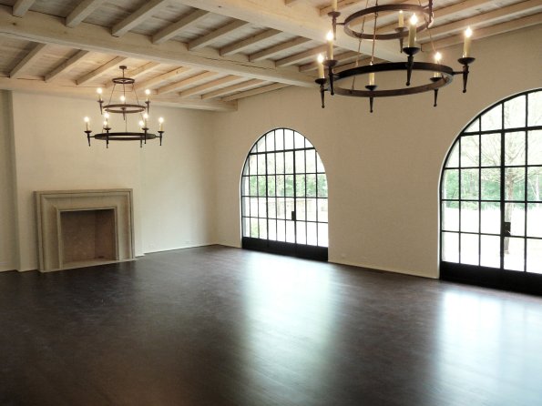
The right-most room is the great room. The round-arched steel windows are carried into this room yielding the perfect view of the backyard and it's beautiful landscaping. The ceiling is an eye-full too. The beams were limed to keep the room light and airy.


Connected to the great room is the kitchen. This kitchen is nothing short of amazing! The grand scale of the Lacanche range and the industrial chic Sub-Zero refrigerator really make a statement. The wall of windows over the sink along with the large island in the center is my preferred configuration for a kitchen. I'll take it!


The rear facade of the home really underscores the astonishing architecture of D. Stanley Dixon, one of Atlanta's most preeminent architects. Land Plus' deft selection of plants also carries over to the rear facade.


And that's the view from the steel windows. Pure perfection. The only thing missing is a rectangular pool running the length of the trees. I'm sure one will be added, though, if it hasn't been already.

Going back through my photos to create this post has reinvigorated my passion for architecture and design.  This house is just so inspiring. A true testament to the immense talent of husband and wife team Stan and Melanie (Turner) Benecki. This house has mastered the language of timeless beauty.

I can only imagine what this house is like now that its first owners have moved in and furnished it. With any luck they had the assistance of Melanie to guide them in their selections.

Ride-by: A Strategic Fence

January 10, 2010 | 6 comments
While out on a training ride this week, I found it quite interesting when I noticed a fence with bronze chess pieces mounted as fence finials. Chess is all about strategy - a real thinking person's game. Such a whimsical detail is a clear nod to the amount of thought that went into making this house a one-of-a-kind estate.


Five different chess pieces are used in repetition to adorn the fence posts. Notice the inscription on each piece; that is the name of the estate.


Those familiar with Atlanta real estate will recognize Descante as being one of Atlanta's most expensive estates to sell in recent history (if ever). Not long ago the home was featured on the This Photographer's Life blog. Click over to Blayne's blog to see her beautiful photography of the home and for a little more information behind the house's name.

Who wants to bet whether or not the owners were avid chess players?

---------------------------------------
This post is part of a series titled Ride-by Architecture that is dedicated to interesting architecture that I find while riding my bicycle throughout Atlanta. Visit the original post for more information on the series. You can also view all posts in the series by following this link.

Look Up - Ceiling Art

January 6, 2010 | 8 comments
A detail I'm noticing more lately (perhaps I'm just paying closer attention) is fretwork on ceilings. I've seen many interesting patterns in various styles of architecture, although this seems most common in English architecture. It's a welcome respite from the chunky coffers you see so often. These svelte, shallow wood (and sometimes plaster) details have an air of clean-lined sophistication and allow for a richer artistic expression when decorating the ceiling.


The version I'd most likely select for myself is this simple, yet bold, one from a home designed by Tracery Interiors and Dungan Nequette Architects. I pretty much love all things white in design, so I was immediately attracted to this room (and the house in general). The house's palette is predominantly neutral with white walls and dark floors. Elements such as paneling on the walls and the fretwork on the ceiling lend enough texture for the white to not seem cold. Remove those elements and the room would feel so much different.


I emailed Doug Davis from Tracery and he was gracious enough to fill me in on the details behind the design and to send me this "before decoration" photo. He and Jeff Dungan worked together to design a solution for the large expanse of ceiling in this grand scale room that they felt needed something to give it character. I'd say mission accomplished. The diamond pattern is certainly a standout feature of the room and does an excellent job of breaking up the ceiling's bulkiness.


Shown here is a beautiful kitchen featured in the July 2009 issue of House Beautiful. There's alot to admire in this kitchen including the quilted doors of the refrigerator and freezer, the French range and the range's hood. However, the ceiling detail really makes an impact. The way this fretwork is enclosed in deeper coffers has the effect of looking as if the pattern was stamped or embossed in the ceiling.


The ceiling in architect Keith Summerour's personal country home is particularly stunning. Keith's genius shines here where he managed to add glamor to a country home via details like the fretwork on the ceiling and steel windows and doors. To view more of this home, visit the August 2009 article about it in Atlanta Homes & Lifestyles.


This close up photo gives a better glimpse of the pattern used on the ceiling. It reminds me of the unique paneled wall in the Mediterranean house I recently posted about.


Another Summerour example in a renovation executed by Benecki Fine Homes. This sedate example resembles traditional coffers, just shallower and sleeker. I have toured this home in person and it is actually on the market now. I recommend viewing the listing as there are a ton of interesting details in the home, as is always the case for Summerour designs.


Although this interior is much more traditional than I lean and not my style so to speak, I couldn't help but notice the Gothic fretwork pattern on the ceiling. Interior design by Todd Yoggy.


These four photos from the Dunnellen Hall estate in Greenwich, Connecticut illustrate the extensive use of fretwork on the ceilings in the home. There are some really interesting patterns there. Imagine these patterns used in a more transitional interior on a smaller scale. Amazing.


Here is a particularly ornate (and grand scale) example from the Vladislav Hall at Prague Castle.

Executed in a contemporary fashion (painted white would be my choice), fretwork can really be a statement making element of a home's design. I love that it gives designers and architects a tool to really apply from some creativity in a bold way.

I know I've seen contemporary fretwork implementations that I liked in other homes, but regrettably I didn't save them. If you know of any, please leave a comment or send me an email with where I can find them. I'd like to collect more photos for my inspiration files.